5 tips for perfect typography
Here are our top 5 tips for perfect typography which is beautiful, scannable, and accessible.
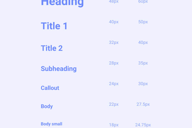
Hierarchy
The most important thing you can be doing to help your typography is learning to nail the hierarchy. This means creating a good visual difference between the specific layers of written content. This helps a user understand what is important, as well as making your content easily scannable and accessible.
A weak hierarchy will make your content hard to read and feel less polished than it could be.
There are several methods you can use to help create a strong and clear hierarchy including the use of colour, opacity, font size and font weight.
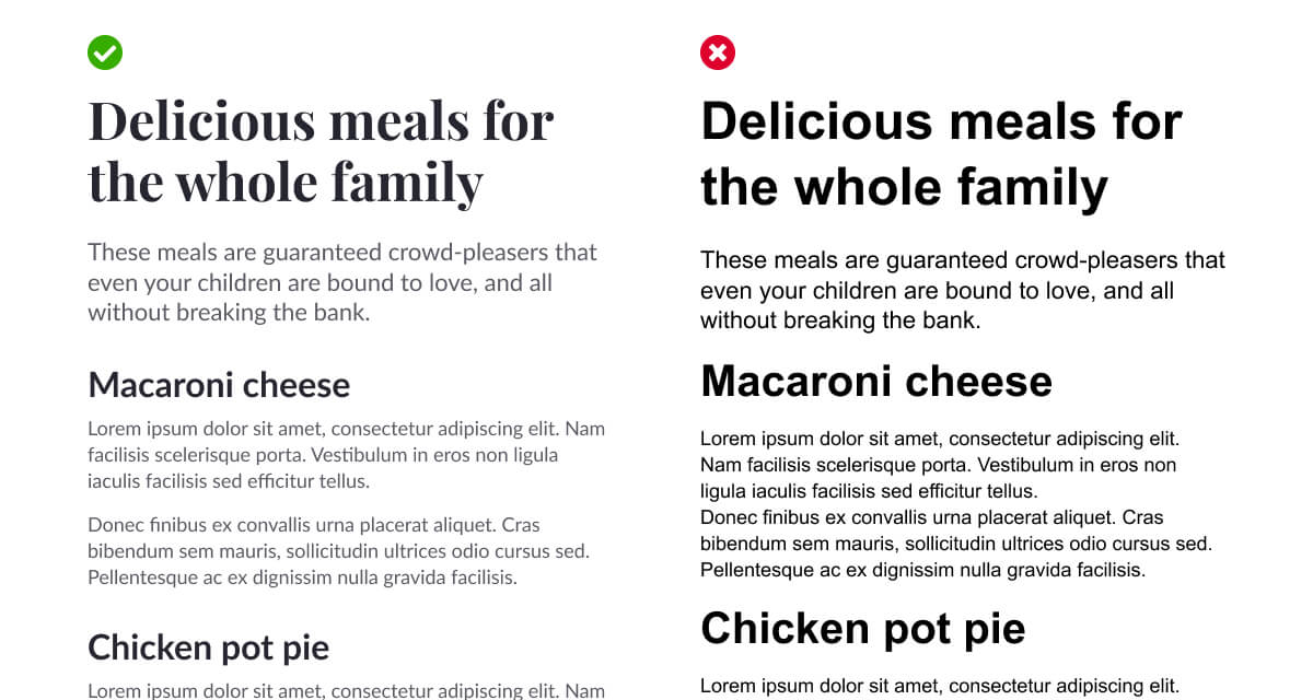
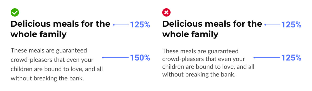
Font size and weight
A very simple one, but use the size and weight of your fonts to create a strong enough contrast between levels of the hierarchy.
Skipping a weight between your body and heading fonts can help create a scannable and clear design.
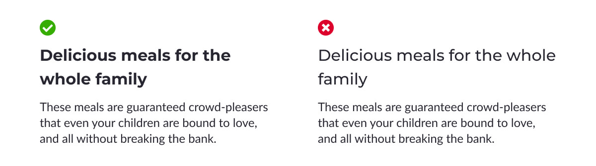
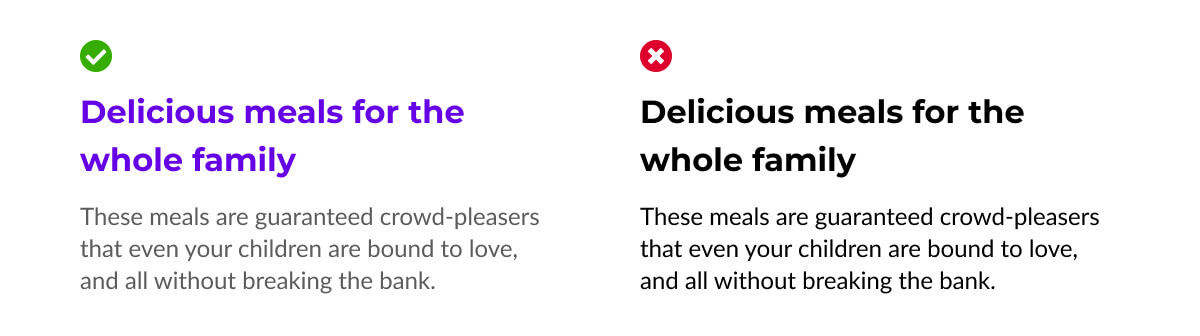
Using opacity
Opacity is an easy way to make your content legible and build your hierarchy. Using a low opacity on your body copy will help your heading stand out even more.
In the example above, the body copy has a 64% opacity. Make sure not to set your opacity too low though, as it could become inaccessible due to having a low contrast ratio.
Also, when using light text on a dark background, consider using slightly higher opacity vaules to keep copy legible.

Using colour
You can also use colour to create emphasis where required, but it's worth being sensible with this. Overuse of colour in your UI can de-demphasize your call-to-actions and make your UI look cluttered.
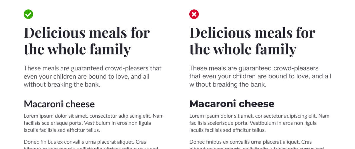
Line heights
It's a good practice to set your own line heights, as generally the default line height won't sit as nicely as it could.
You can also use this golden ratio calculator which can help give you line heights based on your font size.
Larger text needs a tighter line height
You will find that as your font size gets larger, the line height ratio required will reduce. So your titles will have a lower ratio than your body copy.
Increase line height on dark backgrounds
It's also worth while considering using a slightly larger line height when using light text on a dark background to help keep your content legible.

Fonts
When selecting your typefaces, limit yourself to two at most. This keeps your UI clean and reduces page load speed, helping your website load quickly and keep within the Doherty Threshold.
Google Fonts is a great resource for finding free, open source typefaces, and also has a tool to help you pair a title font with a body font.
White space
A little bit of empty space can go a long way in helping your typography breathe and sit well in your UI. It's worth remebering Gestalt's Law of Proximity when spacing elements also, as relationships can be built between items based on how near or far they are from each other.
You can also use letter spacing to help content fit an aesthetic or brand. Increasing your letter spacing is particularly important when typing in all caps; when words are written in capital letters, they are harder to read so some additional letter spacing can help with readability.
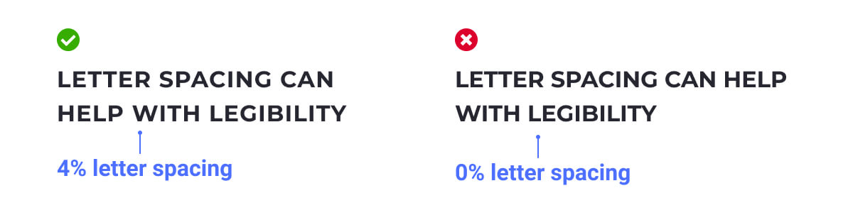
Please note, it is generally harder for users with Dyslexia to read words in all caps, so please be considerate when choosing this option.
Accessibility
It is important that your content is accessible so that it can be consumed by anyone. With that in mind, there are a few things you can be doing to ensure you're creating accessible content.
- Make sure your contrast ratios are higher than 3:1 for large text, and over 4.5:1 for regular text.
- Avoid graphics of text whenever possible, as screen readers won't pick this up
- Limit your use of all capitals and italics
- Avoid use of Display and Handwritten fonts
- Although there are no strict rules on minimum font sizes, 16pt or above is considered an accessible size
Learn more about accessibility
Creating an accessible UI
Accessibility in design allows your product to be usable, nagivatable and understandable by as many people as possible.