Creating an accessible UI
Accessibility is about designing for the many, not the few. There are some simple things we can be doing as designers to ensure our products are usable by everyone.

Colour contrast
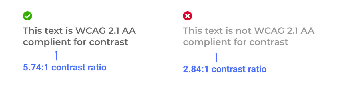
In order for your text to be accessible for users with visual accessibility needs, it needs a strong enough contrast ratio against its background. Make sure your large text (typically bigger than 18px and bold, or bigger than 24px when not bold) has a contrast ratio higher than 3:1, and your regular text has a contrast ratio higher than 4.5:1 in order to meet an AA accessibility rating. Read more about the WCAG text contrast criteria here.
There are also rules for non-text components, such as buttons and text fields, so that the boundary of the components are visually clear. Read more about the WCAG non-text contrast criteria here.
There are many tools you can use to check your contrast ratios, including the Stark plugins on Figma or Sketch, or the WebAIM online contrast checker.
Touch targets
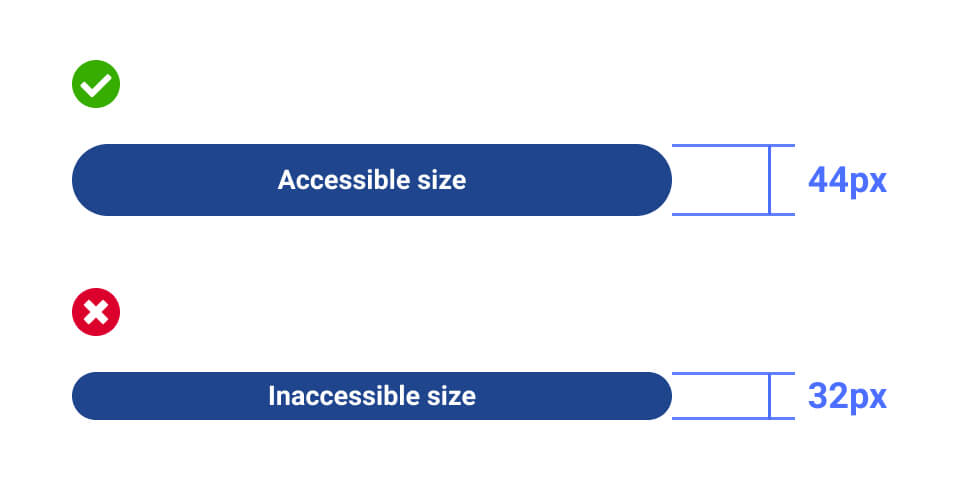
Generally, all elements that can be interacted with should have a tappable area of 44 x 44 CSS pixels. This will help keep your UI usable by users with limited dexterity when using a mouse or touch.
There are different documentations for touch targets based on what you are designing and building for. For example, Microsoft advise a 40 x 40 pixel size for touch targets, and Apple recommend a minimum tappable area of 44 x 44 points for all controls.
Use of colour
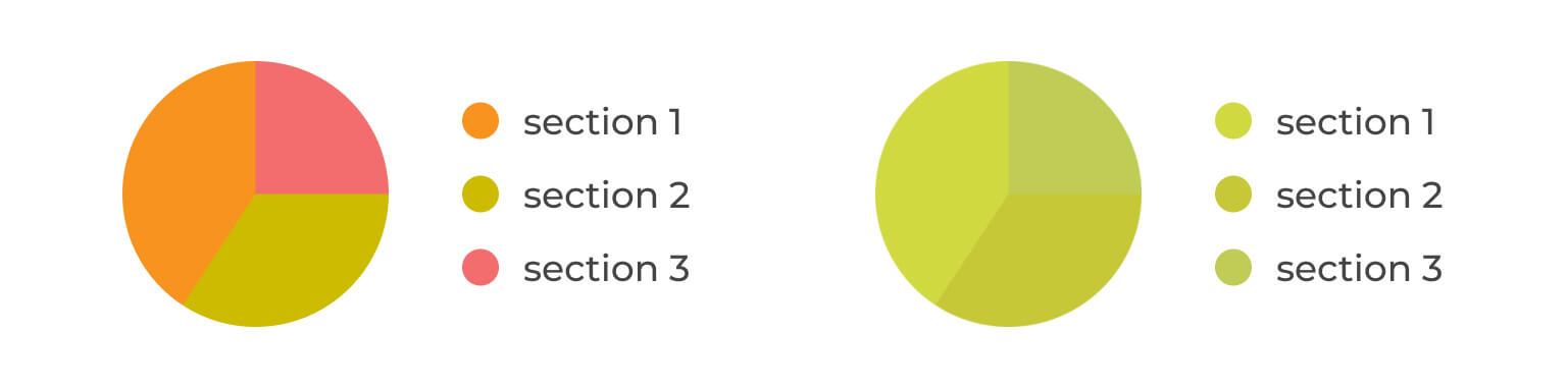
As well as creating a strong colour contrast, your use of colour should be purposeful and considerate to users with various forms of colour blindness. In the image below, you can see what can appear clear to yourself may be indistinguishable to a user with Deuteranopia; a form of color blindness in which the user cannot see the difference between reds and greens.
With this in mind, you should never use only colour to indicate a state, as this can be easily missed. So don't only use the colour red to indicate an error, but also accompany it with a relevant error message.
Fonts and typography
There are no strict rules on accessible fonts, but there are many fonts which are considered to be more readable that others. Display and handwritten font styles can be less legible than most serif or sans-serif fonts, so these should be used sparingly.

It is a good practice to use system default fonts where it makes sense to. When creating native applications on iOS or Android, using SF Pro or Roboto respectively will help create a usable and accessible design that is lightweight.