There is a correlation between a users rating of how beautiful a design is, and the perceived ease of use.
Aesthetic-Usability Effect
The Aesthetic-Usability Effect states that users often perceive visually-pleasing products as being easier to use.

Overview
Here's one that I'm sure the UI and Visual Designers out there will love! If your designs are beautiful, then users will be more forgiving of minor usability issues.
It has been found that there is a correlation between a users rating of a visual design and the perceived ease of use, so it's well worth investing in the visual design of your products.
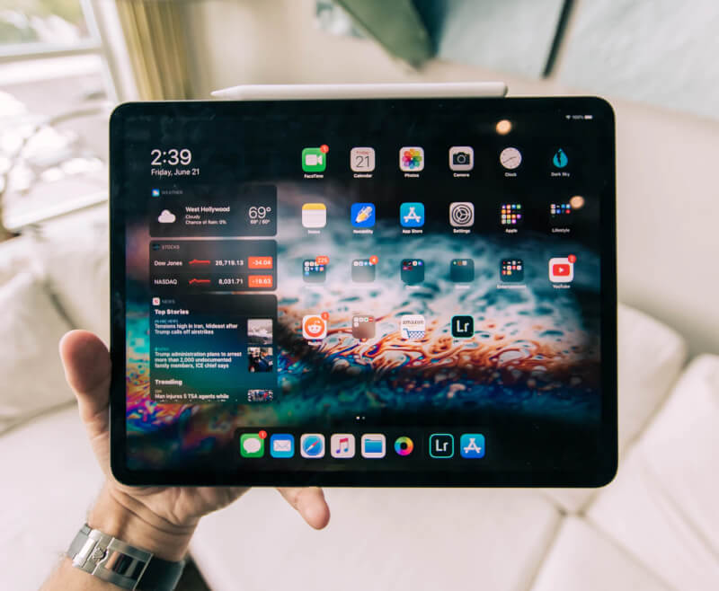
Apple do a great job of utilising the Aesthetic-Usability Effect. They invest in the visual design of their physical products, as well as their softwares which help disguise usability issues.
It is worth bearing in mind that the Aesthetic-Usability Effect will only cover minor usability issues, but not major issues. So this effect should be considered hand-in-hand with an amazing, usable experience.
Key points
A beautiful design can help disguise minor usability issues, but will also make it harder to discover issues in usability testing.
Spend some time on Dribbble to discover some beautiful visual designs and get inspired to create your own
Other UX Laws
Pareto Principle
The Pareto Principle (or the 80/20 rule) states that ~80% of effects come from ~20% of the causes.

Doherty Threshold
If a computer responds to a users input in less than 400ms, the user will take less time to make their next decision.

Hick's Law
Hick’s Law states that the more options a user is presented with, the longer it will take them to make a decision.