Drop shadow tips
Learn some tips on when to use drop shadows, and how to get them looking perfect in your UI designs.
Drop shadows can be an amazing way to add depth and emphasis to your designs, and when used right can make your UI look incredible. Shadows are a nice way of creating a container for content without making it feel boxed in.

Less is more
Less is often more when applying drop shadows. You don't need much opacity at all to get the effect of the shadows, so play around with their subtlety to find the perfect look.

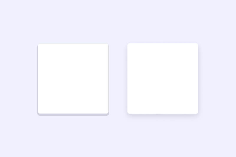
Consider the position of the light
Shadows look unnatural if they evenly surround an object. Adding a Y value to the shadow will better add a feeling of depth by making it seem as if the light source is sitting on above the object casting a shadow.

Find your style
Shadows don't have to be diffused and blurry. It may make sense to have a solid shadow to match your brand or design language. Play around with the values to find a style that best suits your UI.

Play around with colour
Shadows don't necessarily need to be based on an opaque black. It can sometimes look nice to use a tint of a brand colour to a shadow.

Use more than one shadow
For hyper-realistic shadows, use more than one in order to cast a key shadow, and an ambient shadow. Google Material have done some amazing work on their shadows based on this idea. It can be hard to see the difference, but give it a go if you think it's worth the effort.