Toggles aren't checkboxes
Why you are misusing Toggle Switches

Toggles, switches, sliders, flip-flop buttons. The component goes by many names but, semantically speaking, a toggle is a checkbox. It is a UI component which is in either an ‘On’ or ‘Off’ state. When developing a toggle in HTML, you even need to use <input type=“checkbox”>.
However, toggles are NOT just direct replacements for checkboxes. There are different use cases for each component. A toggles action should be boolean and its feedback should be immediate, and a checkbox is much more suited for list formats.
When used in the correct ways, toggles can be a great piece of UI Design.
Love
1. Toggles are attractive
…and in the words of Don Norman, “attractive things work better”.
Don, in his book Emotional Design, is referring to an experiment by Noam Tractinsky, who was looking to find a link between how nice something looks and how usable something is perceived to be. The results showed a strong relationship between the two factors.
“Very high correlations were found between perceived aesthetics of the interface and a priori perceived ease of use of the system” — Noam Tractinsky
2. Toggles are fun
The urge to interact with the toggle is much stronger than that of the checkbox. You can even visualise the fun animation of movement that will happen when you click on the toggle.
The toggle affords interaction by displaying a state, and a state in which it can move into. Which leads into my final point…
3. Toggles are skeuomorphic
Although skeuomorphic UI trends will come and go, skeuomorphic interactions will live on and, as I touched on before, toggles afford interaction. They are familiar because of our understanding of light switches, which makes toggles inherently usable.
“Familiar designs are not noticed, they just work”
Hate
1. Toggles are ambiguous
Toggles are notoriously unclear; It is unclear whether the labels are indicating the current state, or the action that will happen when the toggle is interacted with. The colour goes some way in helping to explain, but colour should never be solely relied on in order to communicate meaning.
If a component is relying heavily on colour to convey its state then it is unaccessible and needs rethinking.
2 . Toggles are misused
Toggles are commonly misused as tabs or radio buttons.
iOS popularised the component known as the segmented control, which is effectively a tab component, used to display different views with the same context. The iOS guidelines for segmented controls states that this component must contain ‘two or more segments’.
When three or more segments are used (as above), it creates clarity between the selected and deselected states. However, when this is reduced to two segments, this becomes much less clear. This component visually and functionally becomes a toggle, and the current state of the toggle becomes ambiguous.
3. Toggles are not skeuomorphic
Yes, I am playing devil’s advocate against myself here.
Although toggles are based on a skeuomorphic concept, the way that we interact with them is not how we would interact with a light switch.
Think about the way you would turn on a light; we flick the switch into the position we want it to be. A digital variation of this real-world interaction would be dragging the switch over to the position we want it to be in. However, toggles are actioned by a click, not a drag nor flick.
Other articles
Living on the Edge
There are hidden benefits when designing for edge cases; you could be designing for more users than you expect.

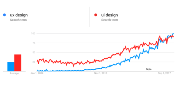
UX vs UI
The world of digital design has expanded rapidly over the last century. As it has grown, so has the need for more specialised job roles within the industry.